Orthography
Much Ado About Possessive Apostrophes
Apostrophes are lovely little critters, but they tend to boggle the mind if you think about them too much. One of the most common questions on EL&U regards proper usage of an apostrophe to indicate possession.
The basics.
How do we use an apostrophe to indicate possession?
If the possessing noun is singular, add an 's (apostrophe-s).
Sara's beast friends were all balrogs.
If the possessing noun is plural and ends in s, add an ' (apostrophe).
The beasty balrogs' game was very fun.
Well, now, that’s pretty straightforward, right? Except that apostrophes have this annoying habit of jumping into your brain and scrambling your thoughts. There are lots of ways to get confused.
What if the possessing noun is plural and does not end in s?
Then treat it like the singular case, and add an 's (apostrophe-s).
The children's books were tucked away in their cubbies. The geese's honking alerted the dog to the fox’s presence.
What if the possessing noun is not plural, but ends in s?
Well, golly, it turns out this one is complicated. Generally speaking, these are treated just the same as other singular nouns:
The glass's rim was cracked.
But this has not always been the case. Historically, names ending in s followed the plural rule:
*Seamus' writings were well-known throughout Galway.
For proper nouns, this is considered a stylistic choice, but following the singular form is more common these days:
Seamus's writings were well-known throughout Galway.
You’d think with just four rules (which are really just two if you think about it) that noöne would have much trouble with possessive apostrophes. But those apostrophes sure are pernicious.
The Advanced.
What if the possessing noun is a conjoined phrase like “my wife and I”?
Kosmonaut gives an excellent answer to this question.
Those rules are all well and good, but how do I decide whether the possessing noun should be plural or not in the first place?
There are a lot of questions about this very sticky wicket on EL&U. Some examples are:
Happy Mothers’ Day or Happy Mother’s Day
Beginner’s or Beginners’ Guide
Does the guide belong to one user or many users? Is the day for one mother or all mothers? Either way is technically acceptable, but generally speaking, we consider a single instance and an abstract entity. So one copy of the guide for one abstract generalization of user means we usually say “User’s Guide.” Mother’s Day is trickier because we could celebrate all mothers on that day, but it is supposed to be a day on which we honor our own mother, so “Happy Mother’s Day” unless you have two mommies.
Finally, we see that possessive apostrophes are disappearing for plural nouns that demonstrate affiliation, so it is acceptable practice to use phrases like “User Group” instead of “Users’ Group.”
That is a little summary of possessive apostrophes, along with some fun links for further reading.
Typography: Striking Language (part 1)
Typography is all around us, every minute of every day. I’m willing to bet that, this blog post notwithstanding, there are at least five different typefaces within reach of you at this moment. I’m hedging my bet, because it’s probably closer to ten or fifteen. You may think little or not at all of typography, but it is equally important to language as the spoken word. By definition, typography is the study, use, and design of identical repeated letterforms. Throughout history, these forms have taken shape and morphed from the shifting popularity and availability of writing implements and surfaces.
Language itself is rooted in visual communication. Before we had language, we communicated with imagery. The story of typography begins with man’s initial use of petroglyphs (rock engravings), pictographs (cave paintings), and pictograms to preserve business transactions, tell stories, give warning, and record history.
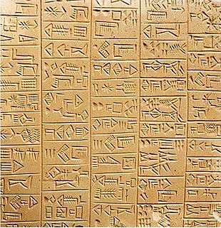
fig 1. Sumerian cuneiform tablet
The ancestral awakenings of modern typography are found in cave drawings, tablets, and Egyptian hieroglyphics, ideography that served to support and preserve spoken tales of the joys and threats that comprised the daily existence of early man. From the oldest Sumerian cuneiform tablets (fig. 1) to the digital typefaces of today, written language has persevered as a crucial auxiliary to the spoken word. The written word is invaluable as a means of preserving the past and language itself. The beautifully-written word adds a nuance of artistic flair and reveals a concurrent history of its own.
The English alphabet evolved from the Latin one used by the Romans and is thought to have grown from Greek, Semitic, and Etruscan influences. Our modern letterforms developed around 100 BCE, and by 100 CE, two common forms of Roman scripts were in use. About one hundred years later, parchment and then paper were developed, and their portability was revolutionary to the spread of written language and of literacy in general. Over the next few hundred years, the Greeks were writing using reed and quill pens with nibs, the changing widths of which altered the pens’ strokes and resulting letterforms.
The earliest form of typographical mass production, relief printing, was developed in China around 700 CE. By 1300 CE it had reached the Europeans, who by 1440 CE were using the technology to print entire books comprised of woodblock-cut text and images. A German blacksmith, Johannes Gutenberg set the printing world on fire with his invention of a moveable type printing press which allowed individual letterforms and punctuation to be set and reused again and again. Gutenberg’s contribution defined the identical repetition that defines typography and largely satisfied the printing industry for the next 400 years. Printing technologies from then on have advanced to serve the growing literate population that Gutenberg’s invention had spawned.
As a discipline, typography is as complex as any other serious subject: the magic of readability and presentation is rooted in an often mathematically-calculated aesthetic. In selecting type, the main concern is the matter of readability. More than just legibility, readability is a marriage of legibility and good design. You’re likely reading this post in a typeface called Georgia, a very popular face designed for the ease of screen reading. Just as Gutenberg’s moveable type served to facilitate the changing times, digital type must capitulate to the limits of the medium to maintain the base principle of legibility. Bad type stands out and good type goes unnoticed, quietly serving and preserving ideas with beauty and aplomb.